
The variability that a "K" can carry
Typography that reflects the times
●Please tell us about how art has been a part of your life.
My father was an architect and my mother graduated from music college, so, naturally, I’ve been surrounded by art all my life. My older sister also graduated from Nihon University College of Art and was going to become an editor. I was interested in contemporary art and naturally set my sights on a career similar to the one I am pursuing now.
●What type of things do you think you picked up from your parents?
My father designed our house in Tottori. It had a glass roof in the hallway. We drove a Beetle, which was pretty distinct for a family living in such a rural area at the time. My father influenced my taste in art and music, and when I was in elementary school, he took me to New York. When I was a child, I had dreams of being able to buy and build a skateboard from scratch.
●What brought you to Tokyo?
I came to Tokyo to go to art school. Since we were in the countryside, my father told me, “If you really want to pursue art, you should go to Tokyo, because you won’t enjoy staying here all the time.” He also told me that I should practice painting, so from the time I was in high school, I attended summer classes at an art college preparatory school in Tokyo. I was given an allowance at the time and I told my parents that I was using it to buy equipment, but actually, I was buying used records with my friends, with whom I’m still good friends today!
●When you were in school, what art made an impact on you?
I was taking in various art at the time but gravitated towards sculpture and conceptual art. For instance, Joseph Kosuth’s “One and Three Chairs” was about how the chair as a concept was established. He represented the chair as art using three concepts and mediums: the actual chair, a picture of the chair, and the word “Chair” in the dictionary. I also admired Hans Haacke’s almost documentary work on the theme of political correctness that exposes the inner workings of corporations. Politics are not unrelated to art. Having such works as inspiration and also parents who were a part of the student movement generation, I was attracted to works created using the themes of culture and politics.
●What did you envision would happen after you graduated?
I wanted to be a contemporary artist. But such a pursuit would not lead to any money, so I thought of going to graduate school at an American art college and becoming a researcher. But it was no good in the end.
●What did you learn from art school in Japan?
This may be both a good and a bad thing about Japanese art universities, but since it is difficult to get in, everyone goes to Tokyo University of the Arts to improve their technique. They learn various ways of painting and become dexterous. At the time, the odds of getting into the painting department (oil painting department) at Tokyo Zokei University were 40 times higher. So when I couldn’t afford to eat, I thought it would be great if I could use those techniques to make a living, so I created an artist group with my seniors. We were working on the concept of selling 12-inch record-sized paintings to stores as interior decorations. We started taking orders for design and illustration because painting alone was too demanding, and that’s when I began growing fond of design.
●What other activities were you involved in?
When I was a student, there was this small hut outside of IDÉE where people could sell their own work, but you also had to sell coffee alongside it. I was there for about a year and they really looked after me well. It was during that time that I met Mr. Kurosaki (*1).
※ 1 Teruo Kurosaki
Founder of IDÉE and an entrepreneur and producer who creates spaces and places of learning such as Farmers Market, Midori-so, and Freedom University. He examines the times under the theme of “Exploring Lifestyle” and proposes new ways of living and working.
●Do you think at the time there was less room for art to ‘fit in’ compared to now?
Now there’s a market for street art but at that time in Tokyo, once you created a piece of artwork, you would exhibit it, but basically, the only way you could make money was to collaborate with a brand and make a T-shirt. It made me feel uneasy about continuing to work as a “loose group” between artists and designers, and it made me think that it might be better to do graphic design.
●That’s when you decided to move your base to Midori-so?
That’s right. I started designing flyers for events. When I first joined Midori-so, I was still doing things like graffiti.
●Were the conditions of that era reflected in your design works?
I was drawing street art-like pictures. But when I think about it, I didn’t really like street art that much, I was kind of just going with the flow. I think I’m good at discovering interesting things on the spot, so I just went with the flow and thought it was fun, which gradually led to my involvement in graphic design and branding. I think it’s more fun now.
●There are artists who can change themselves according to the changing circumstances around them, and there are those who can’t, right?
There are people who can continue to do contemporary art and other things for a long time even if they don’t make any money at all. And that’s the kind of life you have to live up until your 30s. I found out I was not one of those people. So I thought that perhaps I wasn’t strong enough to make it as an artist.
●Was there a project that was a major turning point for you?
NORAH (*2) and TRUE PORTLAND (*3) were probably the most significant. I didn’t know anything about editorial, but somehow I was given the opportunity to work on them. Of course, I learned a lot, and it sold very well. I think it even helped to create the Portland boom.
※ 2 NORAH
A quarterly magazine edited and published by Farmers’ Market that delves into daily life and the environment surrounding it, with “Nora work” as its core theme in each issue.
※ 3 TRUE PORTLAND
An unofficial guidebook to Portland, Oregon’s Creative City. Each section is categorized by verbs, such as EAT, LISTEN, and MAKE.
●Did you often go to Portland and other places overseas?
I don’t really like to travel. I’ve been to the places featured in TRUE PORTLAND, and I’ve also been abroad for branding jobs, but basically, I don’t like to travel much. I worked the hardest when I went to the U.S.! I lived in the east part of New Jersey for six months, studied for the TOEFL (English language proficiency test), and visited schools specializing in art, and that was probably the most drastic time in my life.
●Was it around the beginning of the year 2000?
I believe it was around 2003. It was around the time that Internet cafes were just starting to open, and I was logging into Hotmail and so on. New York, like Kyoto, is laid out in a grid, so I could get by without Google Maps or anything, but you knew to be careful about where you went, such as not going too far up into the northwest part of the city.
●Did you gain anything in those six months?
Although I don’t speak English that well, I think I became comfortable talking in the presence of various people without fear.
●When did you first come into contact with Kabutocho?
The first time was when I was approached by Mr. Matsui of Media Surf, who asked if I would be interested in a project related to the area. When I work with Media Surf on a long-term project, I usually prepare presentation materials, so if we get involved from that stage, I often learn about the project at a relatively early stage. Usually, branding discussions tend to come later in the process, and in some cases, the only information we have is the CG graphics of the expected completion. So I was looking at that material two years before K5 opened, and I was beginning to make roots in Kabutocho.
What are your first impressions of Kabutocho?
I thought it was just an average city center! I had never even heard of it, but things like “Tokyo Stock Exchange,” or “office district,” were the words that first came into my mind. Maybe it’s because I’m one of those people that just goes back and forth between their house and office, so I hardly ever walk around the city. I was worried about whether people would really come here.
●What was your first impression when you saw the property in its skeleton state?
As soon as I saw it, I thought it was going to be really cool. Since Japan is basically built from wood, there are not many historical buildings left that can be used as assets as they are. I thought this building had great potential. However, it must be done thoughtfully in order to create a new context. That kind of thing should be done by someone with experience. Mr. Kurosaki and Media Surf have been working on how to approach a space while exploring its context, and I was aware of this when I helped them to create it. And this project was a lot of fun because I was given a certain degree of freedom to do what I wanted.
●What was the benefit of exploring the context in advance?
I don’t remember who it was, but we decided to take pictures of it in its skeleton state. It was good to be able to use it for both teasers and advertisements. It was not a graphic design project that forced us to think about the commercial facility after it opened, but rather to work with the way it was developing. So we got to know the place better in the lead-up to the opening. I think it was a good thing that we were able to do this.
●What was your first task?
The first task Mr. Matsui gave me at the meeting with CKR (*4) was “tasteless and odorless,” and I wondered if it was about making the most of the contents. I thought it would be better to simply start the branding project by creating a typeface for K5 first.
※4 CKR
CLAESSON KOIVISTO RUNE is a partnership of three Stockholm-based architects.
I thought it would be better to use this rather than just sticking to the 'combination of a mark and a letter' approach.
●What typeface did you choose?
It was a historical place, so I began my exploration by flipping through a collection of typefaces from an old typeface maker called Monsen. In the old days, fonts were not in data format as they are today, and there were typeface books that compiled derivations of various typefaces from different countries.
●How did you work with CKR to create the typeface?
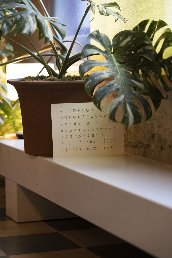
We lined up A3 sheets of paper with the typeface printed on them, looked at them, and said to each other, “We always use Avenir, it’s good isn’t it?” So we began to create a typeface as the first step of branding K5, using the thin typeface of Gill Sans as a motif but reconstructing it in a more modern and geometrical way. CKR often compiles the before and after of a project into a book. In Japan, we are not so familiar with this kind of idea, so it was interesting to work together in this way while exploring the context of the project. It’s also connected to conceptual art, and I felt that we were able to complete the project.
●How was your branding design presentation?
At once, they said, ” I like it! (Applause).” And then left!
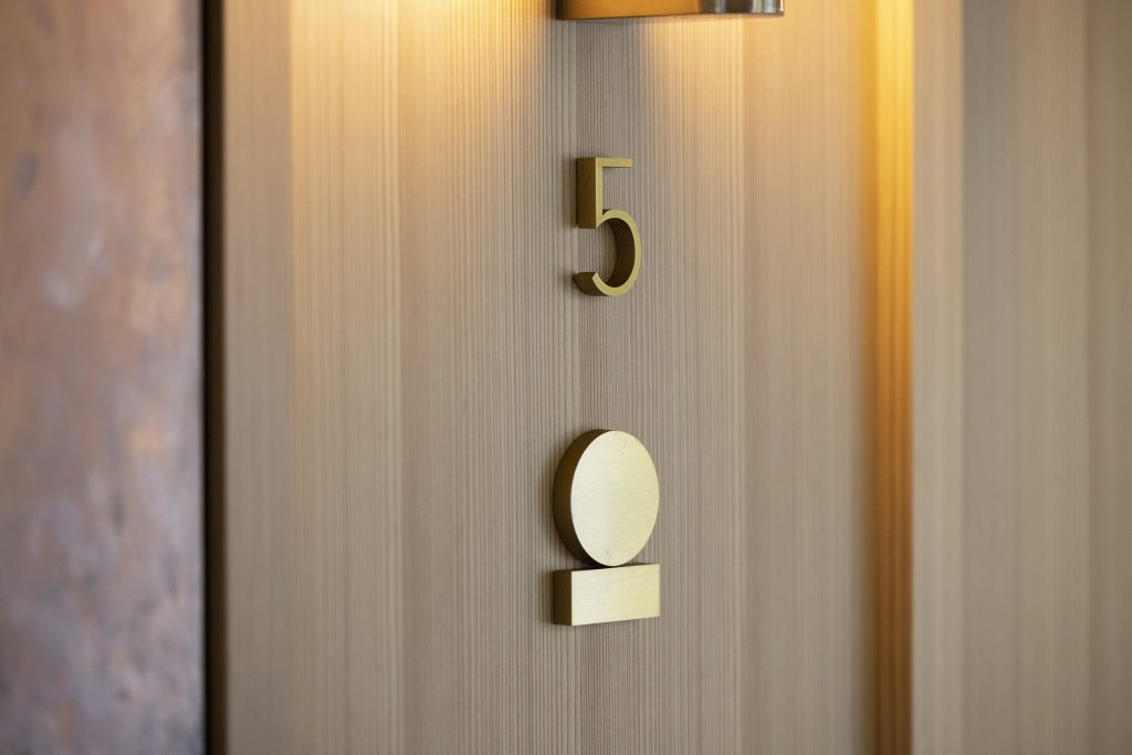
●The K5 logo consists of a regular circle and square. What was your thinking behind the design?
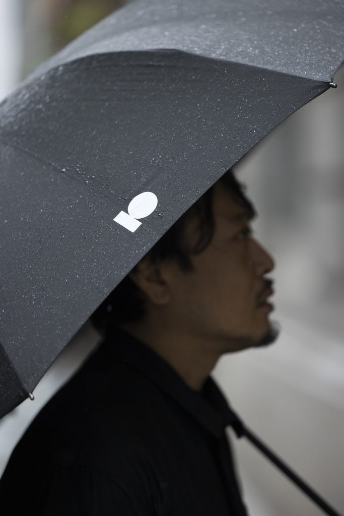
That mark was based on the original wall decoration of the K5 building. I thought it would be better to use this rather than just sticking to the ‘combination of a mark and a letter’ approach. When I visited ACE HOTEL in Portland, I began to think that their branding was a bit on the nose. I felt that the ACE HOTEL in Portland and the ACE HOTEL in Brooklyn are completely different. I feel that branding that unifies everything without regard to local context is coming to an end in some way. With that in mind, I made a rule that the letters K5 and the logo could not coexist on a single screen, but I also decided that no matter how those two graphic elements were combined, they would become the K5 logo.
●What was your impression when you heard about the concept of Kontext?
I thought it would be extraordinary if we could realize a way of urban development where the original buildings and assets of the city are utilized, and from there new elements are gradually dotted around the city. Especially because I don’t think there is such an example anywhere in Japan yet. One person commented on the urban development of Shibuya, saying, “They just build big buildings around the stations without any context and do urban development that is not based on the area itself.” Such development is taking place all over Japan. I was also saying something along the lines of “There is no reason to say there is anything wrong with that, but I think that if there were brands like Media Surf who develop urban areas, this society would naturally become more interesting”.
●What would that look like?
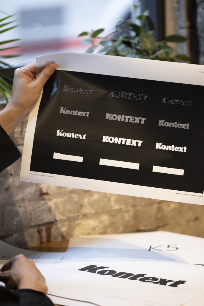
I really like to eat and walk around in my territory, but I’m sorry to say that most good restaurants are chain restaurants, aren’t they? Now it’s impossible to open a Chinese restaurant in Nakameguro without a lot of capital. But I thought about how Kabutocho is dotted with such people and how the town would become truly affluent when they became a surface, so I created the Kontext logo with that in mind, with the dots becoming lines and then surfaces.
First of all, I have to figure out how to make sense of it, structure it, build a story, and organize it to convey it to others.
●How did the typography of Kontext come into being?
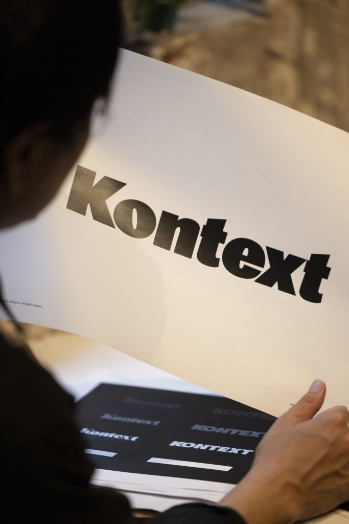
I created a tight letter set that is as close to a flat surface as possible, with no gaps. I made the gaps between the “O” and “N”, which are known as counters, as narrow as possible, and created the letters as a mass, almost as a surface, with no gaps between them. The back print of the Kontext T-shirt is similar. The smallest unit of urban development is the person, so what was once a dot is gathered together to form a town, and finally becomes a surface. Expressing this in typography was also linked to conceptual art, which I encountered when I was a student. That’s why I think my work is becoming more and more enjoyable now. It’s not just about the business of looking good, but also about the invisible structure behind the scenes, which is the strength of my work, by properly referring to and reaching a consensus on the structure behind the scenes. It’s not just about understanding the concept, it’s about typography and branding techniques.
●I think the whole idea of contextualization is also relevant to PR, and creativity in general.
After all, our role is to speak for others and communicate with others, so I guess we are the same in that sense. Editorial is the same way. First of all, I have to figure out how to make sense of it, structure it, build a story, and organize it to convey it to others. If you can’t digest that, you won’t be able to understand the person, and you won’t be able to create anything.
●What was the concept of the Kontext website? It’s black-and-white, yet colorful?
The top page is in black and white, but when the cursor is positioned on the page the color changes. The gradation in the background of the person on the individual pages was achieved by asking a web designer to read the person’s photo and create the gradation. I wanted to express the aura of the person’s background as an embodiment, or rather, the atmosphere that the person has as a background.
●Text is really interesting! I think it’s a great tool for people to get information. To the reader, it’s just a tool to obtain information, but when design is added to it, it broadens its scope.
Yes, that’s why I like it. In Midori-so, where I have my office, a Swiss typographer named Noel, who started a typeface design company called “Grilli Type” regularly rents a desk, and he comes to me and says, “The wide O needs to have thicker horizontal lines.” He used to be a graphic designer, but he quit because he didn’t want to have to bend to the client’s wishes. So he became a typographer because he thought that if he just made letters, no one would question him. His university professor told him that it would never work because there are already great fonts in the world, but he was very successful in developing fonts exclusively for the websites of famous foreign media. That’s how much potential letters have and how interesting they are.
●What do you think are the elements that makeup letters?
When we look at letters, we can see that there are vertical and horizontal lines. If the vertical line is not thicker than the horizontal line, it looks strange to the human eye. The reason why flat letters create an optical illusion when viewed from an angle is because the vertical lines become thinner, but the thickness of the horizontal lines remain the same. But letters are not all logical. In the end, I think we need to make a final decision on the optical appearance. So, there is only logic, and then the optical judgment outside of it becomes important. I feel that only when there are rules and concepts there, the logotype is complete.
●How did you design the font for K5?
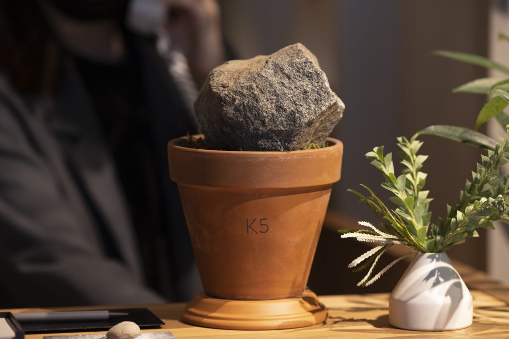
In the old days, letters were written by hand. Very dexterous people created the characters by making them in a way that is difficult to do nowadays. But the great thing about digital technology is that it allows you to do that with ease. That’s why it is possible to make every letter of the alphabet unique, and it’s also possible to create and share that data. It can be used outside of the designer’s involvement. Even if you refer to old letters, you have to work on refining them on a computer. That’s how we created the K5 font. The “K” could be attached or detached in any number of patterns, so we created each letter individually to determine which to use. However, I believe that the reasons why it looks solid or not may vary with the times.
The creator must be able to believe that there is beauty in it, no matter how minute it may be.
●Does this mean that the way we see fonts changes depending on the times?
I’m working on using old typefaces as references, and what criteria I need to use to turn it into a digital format. Of course, optical typefaces can be wonderful, but because they are written by hand, no matter how sharp the corners are, if you zoom in, the corners will eventually become round. But the great thing about digital now is that you can bring the logic of anchor points to those corners. Depending on the numerical settings, corners can be beautifully designed as corners. So I think the technical aspect has a lot to do with it, along with the changing of the times.
●So does that mean you made the typeface from A to Z?
The most important point is that no matter how unusual or simple the typeface may be, it’s important to make a quick impression and to create it carefully, believing in the power of the typeface. I thought that creating and sharing original typefaces and using one typeface for everything from signage to printed materials and websites without any strange inflections would be the strongest element in the “tasteless and odorless” branding.
●It’s kind of romantic to have so much background hidden away but to ultimately leave it to the human eye to do more than retain that element.
The creator must be able to believe that there is beauty in it, no matter how minute it may be. If not, there would be no need to hire CKR, or to fill in the broken bricks with concrete. More importantly, there is no need to renovate. So I feel like I’m doing the work of refinishing what was originally there and making it look the way it should look today.
●Do you think letters should be variable with the times?
I think it will change in the future. Actually, I don’t think this is the end of it at all. I will continue to refine it in the future. On the web, it’s not possible to set details like in-design character sets, but K5’s web Latin text is K5 type, and I am sure the relationship between the web and text will continue to evolve as technology advances in the future.
I still think it’s important to create a situation in the city to generate contingent phenomena.
●Does the combination of rectangles and circles follow the proportions of the side-by-side figures at the entrance?
Yes, it is. I just changed the numbers to a more manageable ratio. It’s pretty much the same. At the beginning of the project, there was not much talk about the importance of the mark, and I think it was more like it came up when we started to think about the issue of trademark.
●When I think about how many different contexts are hidden in there, it kind of makes me afraid to look at the letters!
But isn’t that what typefaces are for? Hiragana, katakana, kanji. People from various countries have created alphabets. It tends to be self-satisfying, but it is changing to convey something. There are many different types of graphic designers, and there are also people who don’t make every single character. I’m not saying that this is right or wrong, but I guess I like DIY in a way. I did the illustrations for “TRUE PORTLAND” by myself, and there was no need to ask an illustrator to do it. I also draw my own illustrations, make my own graphics, direct photo shoots, and create typography. I just want to do it! I just want to make it myself!
●What’s next? What would you like to try?
Video. I would like to create motion graphics. But I feel like I shouldn’t increase my practical work somehow! I would actually make more money directing, but if I can’t do it myself, it’s a complete waste of time. Then there is also the question of how much to entrust to assistants.
●What is the next phase of Kabutocho from next year onwards?
Isn’t it the case that there will be a succession of self-serving stalls opening from outside the planned framework? Not only restaurants but galleries as well. It could be a combination with the current stores, and various situations could arise from there. There are still some old buildings, and we could add more artistic elements to them.
●Is there anything you would like to do in the Kabutocho community development?
I’d like to do a block party in Kabutocho. When I exhibited in LA a long time ago, I saw HYPEBEAST having a block party in the space between buildings, and they had a DJ booth and blasted music. It’s a financial district, and it would be cool to build a stage with golden pipes or something by architect Daisuke Motoki of DDAA.
●I want to go to that block party! As you say, it seems that leaving the phase with the gimmick will be the key to the next phase.
I think that is where the most results will be questioned. I still think it’s important to create a situation in the city to generate contingent phenomena.
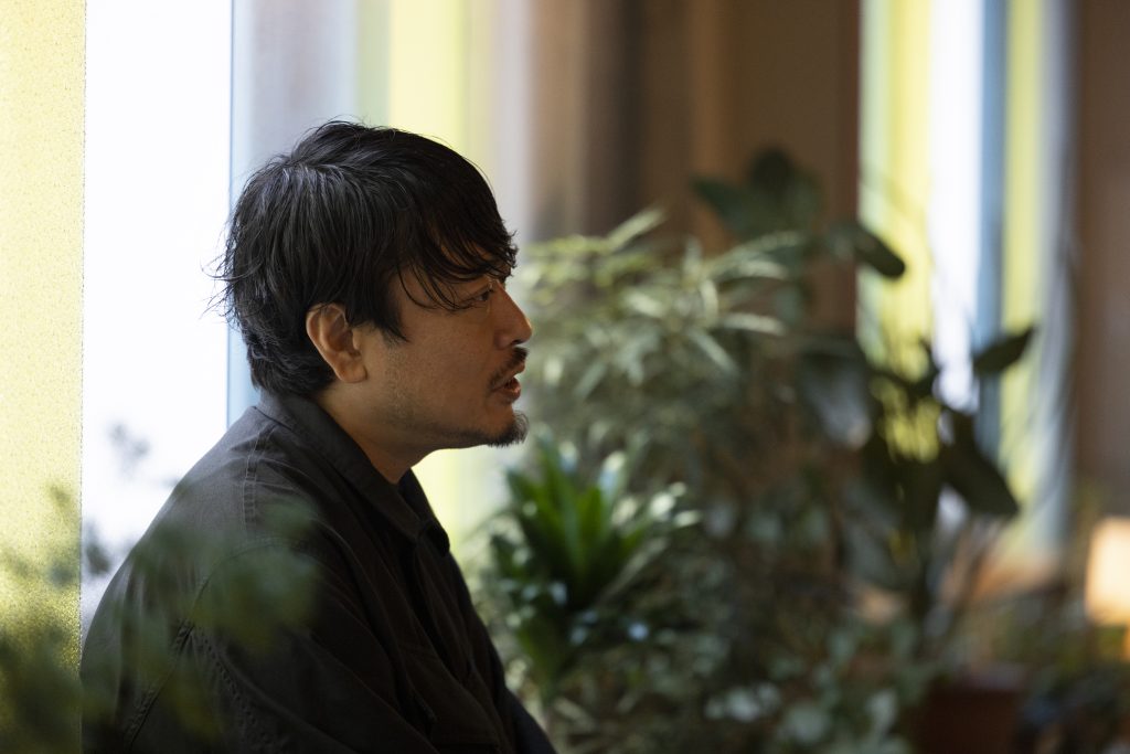
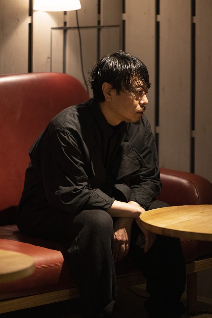
Shinpei Onishi
Born in 1978 in Tottori Prefecture. After graduating from Tokyo Zokei University with a degree in painting, he moved to Midori-so after working as an artist. He began his career as an illustrator and character designer. Since then, he has walked through the design field as an art director and graphic designer and is currently working on numerous projects across the board, from advertisements to books and branding for movie theaters and hotels.
Text : Jun Kuramoto
Photo : Kaoru Yamada
Interview : Jun Kuramoto
